Research
It is hard to separate my research from my life of curiosity and appreciation of people, making, and aesthetics of nature and the manmade. Sometimes I am compelled to write; sometimes I make artists books; sometimes I use design as a tool to repurpose, innovate or connect. It defies silos, and cross-references into webs. I really like that. All things are connected.
Design inquiry
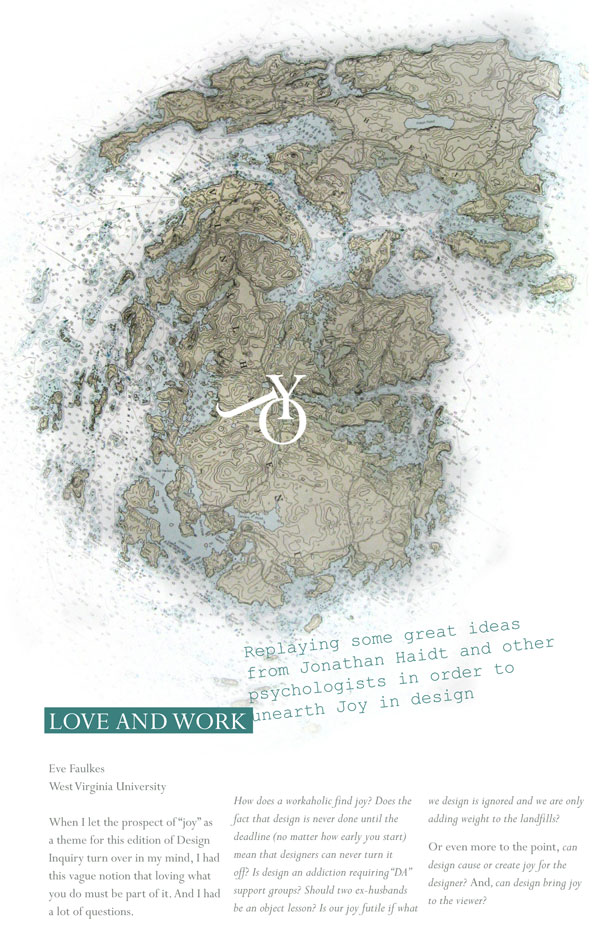
This is one of the best ideas for personal research and conference design in which I have participated. Located on Vinylhaven Island off the coast of Maine, participants are all presentors with a level hierarchy though internationally significant designers, philosophers and architects are mixed with students and faculty whose proposals were selected. Morning presentations lead to afternoon workshops in a commune-like setting where all shop for groceries and cook together (or swim and kayak) in a gorgeous setting. I borrowed components for our Designing for the Divide conference. Below is the published paper from my presentation when the them was Joy.
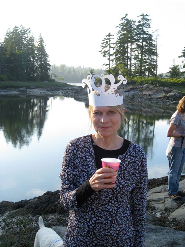
This is the setting for Design Inquiry. My colleague is sporting one of my contributions to the theme when we "dressed up" for cocktails.

Inside spread from my Design inquiry paper on Joy and Work, based on Jonathan Haidt's social psychology theories. 18" tall gate-fold format.
Giving Voice and Empathy
Being able to walk in the shoes of a demographic for whom you are designing is the most important goal of research that can lead to the right idea. This is when design can have the most meaning and how value gets added to the project. I have written about this aspect in topics of papers that are listed in the Résumé section. Below are two groups that I felt good about reaching.
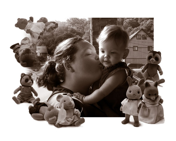
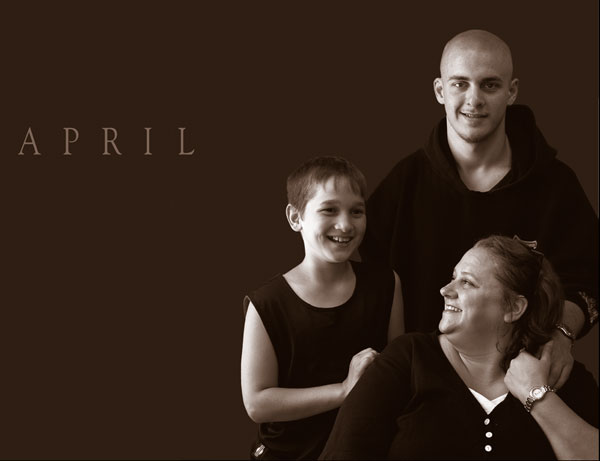
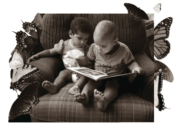
The goal was to reach new mothers or pregnant teens in rural parts of West Virgina who might qualify for help in a program offered by WVU Hospitals. Though they might be leery of outsiders and embarassed about their situation or their poverty, I hoped to reach them by emphasizing the bond they would have with their babies and the innocence and imagination of children that defies economic status. I used brown duotones instead of color to minimize distractions of dirt or clashing colors of the cacophony of kids toys. I also softened the edges of the frames with elements that fascinate and preoccupy wide-eyed babies. We wanted to show current particpants to help new ones feel comfortable joining the program. As the photographer adn designer, I needed to earn the trust of the moms as well.
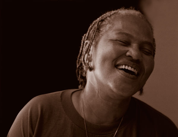
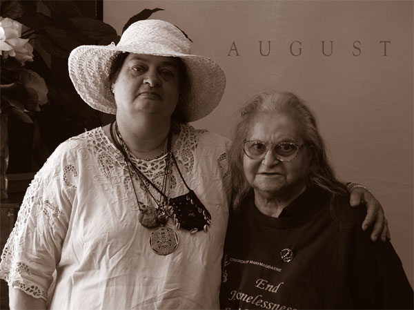
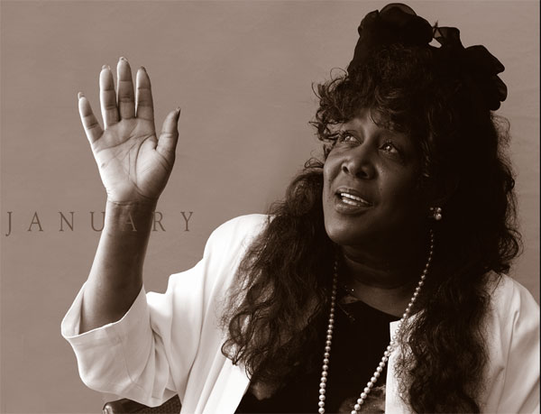
For another demographic, homeless women in a Seattle shelter called Mary's Place, I was able to use a similar approach to make portraits of women there to give a face to those we too often look away from on the streets. Beauty and Strength was a fundraising calendar that celebrated the strength of that community and the courage and individuality of the women with their stories. Due to the trust they had in my daughter who worked there, they permitted me to photograph them unposed for the most part. The resulting images were exhibited in an important gallery in Seattle, alongside one of my favorite phtogapher, Karin Rosenthal. The women attended the opening, signing autographs, and CNN covered the event. They are permanently on display at a new seven-story YWCA in Seattle.